& Food Project
Before I start here with my thoughts on this project, let me warn you, I enjoy talking about typography…maybe too much. I can thank Eric Ligon—my typography professor from art school at UNT in Denton, Texas. Eric didn’t necessarily light the flame for my love of typography, he simply had an infectious passion that fanned my flame into a bona fide wildfire. Side note, I went on to teach typography and subjected my students to the same rigors Eric put me through. I’m thankful. I hope my former students are as well.
The ampersand seems to be loved by all in and around the creative industry, whether you’re an art director, a photographer or pillow maker. We continue to see it show in advertising, brand names (eg. Crate&Barrel, Room&Board, Dean&DeLuca) and even home decor (see previous pillow reference). I suspect it’s because we all have this wanderlust with the many variations the ampersand comes in, or can be created with.
While other characters in the alphabet are typically within a standard or expected shape and expression, the ampersand takes many creative forms. The fanciful iterations can ultimately be linked to the origins of the ampersand—a ligature for “et”, the Latin word for “and”.
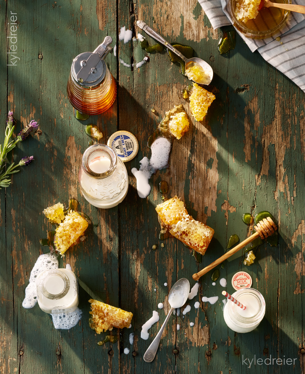
Well, I guess I’m like many others—my fascination and desire to play with the ampersand must be expressed. So, why not find a fun way to play with food and the ampersand shape? For this I decided to shoot foods normally ampersand-ed…like Fish & Chips, Mac & Cheese…you get the idea.
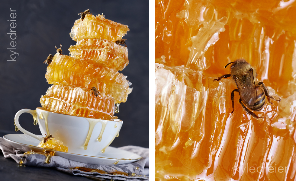
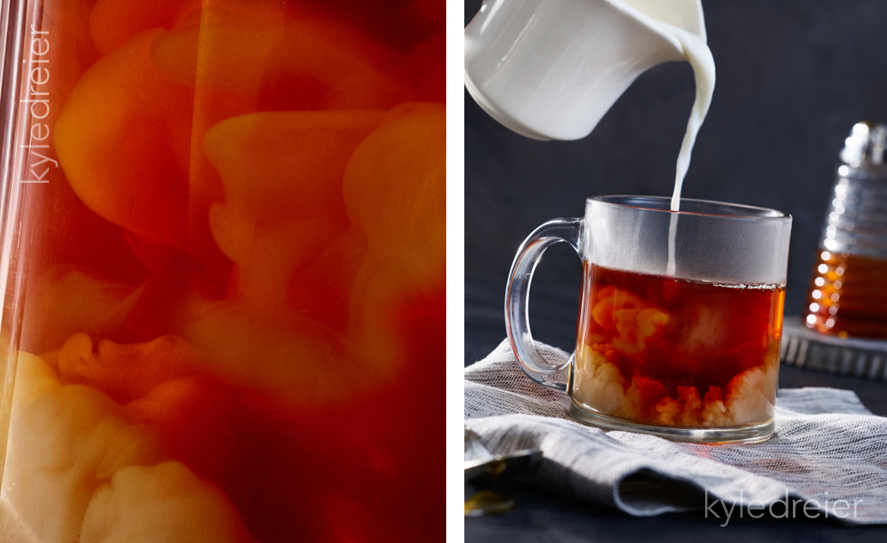
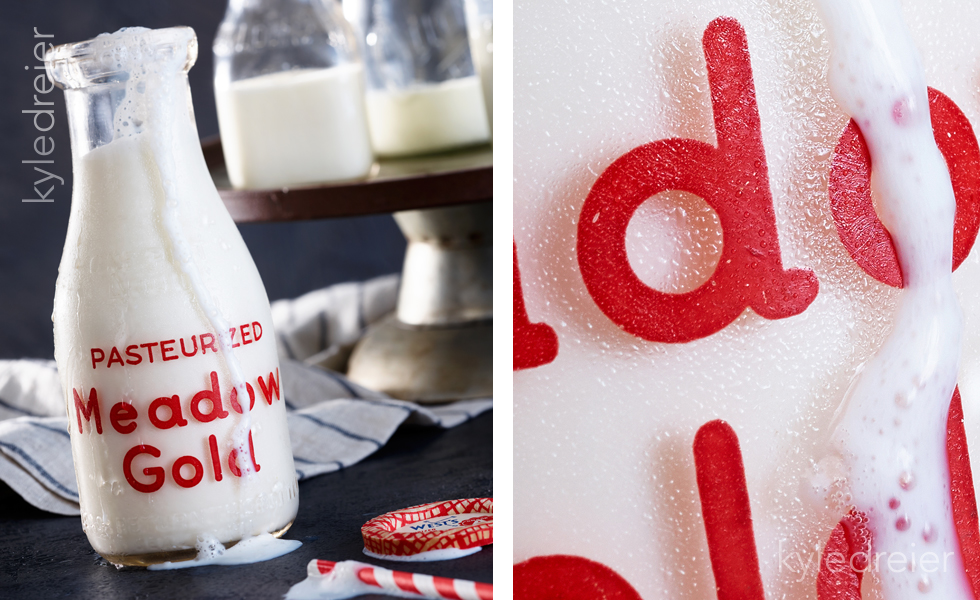
This is an ongoing series and you’ll see more here over time. For now, let me introduce you to Milk & Honey with food styling by Callie Blount. Also on set with us was our own Emily Pierce with prop wrangling and styling.
– Kyle


